A Rose by any Other Name II – Floral Oil Paintings Contemporary Art by K.L. Britton

Screen Shot 2018-10-26 at 4.18.05 PM

As a portrait focused artist, I used to loathe flowers.  I thought they were tedious and unenjoyable – but as I developed my art I grew a deep love and passion for them.  Flowers can have so many meanings, empathy, joy, love, compassion.  Flowers represent emotions, they represent pushing through obstacles in our lives and overcoming hardships, they represent sharing joy and enjoyment with others.  Here is my full painting, A Rose by any Other Name II, my beautiful floral painting, now available on e-bay here E-Bay – K.L. Britton art.

Thank you for reading!

Floral oil painting on artists panel by contemporary artist K.L. Britton roses

A New Sketchbook – Moleskine Cahier 30 Plain

Once upon a time I challenged myself to fill an entire Moleskine with “art I wouldn’t be embarrassed to show people.”  This challenged me to take time in laying out my drawings, and I filled the whole sketchbook for sure.  This time, I wanted a new sketchbook with less intimidation (over 100 pages, and A5 size was big!) so I bought a three pack of the Moleskine Cahier 30 page Plain notebooks.  The “plain” paper has always been my favorite for graphite, I really can’t find any that I love as much as this.  So I’ve decided to fill her up.  Here she is, 4 drawings in.

20180922_193218

20180922_193116

20180922_193152

Screen Shot 2018-09-26 at 2.02.34 PM.png

I challenge you to fill one of your own, and take enough time to make it “drawings you won’t be embarrassed to show.”

We will see how long it takes me to fill my own – just a small sketchbook of 3.5″ x 5″ and still a challenge!  Wish me luck!

Drawings and sketches by working fine artist K.L. Britton

Lessons and Workshops:

losangelesacademyofart.com

Simplifying the Edges –

Screen Shot 2018-06-23 at 9.06.56 PM

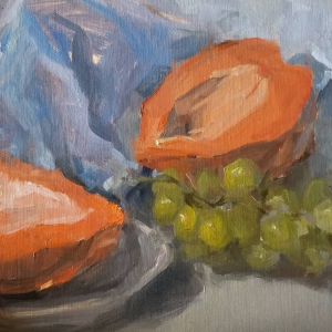
Good morning.  Today I’m talking about a painting I had at the Flower Pepper Gallery’s Summer Show.  This is a still life of orchid leaves inside a copper pot with an orange.  In the setup, there was also a pear, but I knew I wouldn’t finish the pear if I added it – and the composition made it look very odd, too close to the edge of the panel, so I made the decision to leave it out.

Screen Shot 2018-07-02 at 10.43.45 AM

Composition: When I’m coming up with an idea of how I want my painting to look, I often take a photo, and crop that photo to the size of my canvas on my phone.  This way – I can see different placements of my objects and how they would affect the viewers eye.  I also use the View Finder (the small gray square with retractable window) for finding composition, but in this case I did it on my phone.  Since I had trouble with the pear, I left it out entirely.

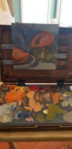
Painting: You can see here that I have in more or less simplified ALL areas of my colours that will be taking up the whole painting.  This is only about 30-40 minutes in.  A huge advantage of this is that if I don’t want to get too detailed, I can simply leave it as is, and its a more abstract painting.  If I don’t “finish” I won’t have something that looks clearly unfinished, I’ll have a fully realized painting, just some areas will be more abstract than others.

Screen Shot 2018-07-02 at 10.43.32 AM

Here I’ve started to add some details, particularly the large swathes of lights and shadows on the copper and leaves.  Pay attention to each object as it’s own object, so a full value range for the leaves, and also the object as it relates to other objects.  Some of the darkest areas on the painting ended up in the leaves, and the leaves and orange both have reflections on the copper pot.

Screen Shot 2018-06-23 at 9.06.56 PM

The finished painting.  As you can see I really enjoy painting copper and shiny objects.  It was a fun challenge to show the warm light and the two soft, cool, window lights that also affected the pot.  I loved doing the reflection of the orange, and pushing that dark shadow in the leaves that really made this pop.

Thank you for reading.

The Papaya – Oil Painting tips from Los Angeles Gallery of Art K.L. Britton

Screen Shot 2018-07-04 at 6.58.58 PM

The Papaya

Oil on Panel 8″x8″

20180704_105209

I am very lucky to be surrounded by people who love art.  I met Marian at the Sean Cheetham workshop, and she invited me to work in her studio once a week.  We get together with some very incredible artists and practice speaking Mandarin and English, teaching each other about painting, and learning from Masters.  Here is our selection this week, with my Edge Pro Gear Paintbook Pro as my go-to for longer sessions, although with the 8″x8″ size of my panel, the Sketchbook Pro would have done very well.

20180704_105255

Our setup, some rich, luscious papaya slices and grapes!  Looked delicious.

20180704_105302

Here is a picture with my palette part of the way through.  Here you can see each “section” has it’s own area on the palette.  I can use these to mix with one another in order to show things like bounce light.  Ex, the green went into some of the shadows because the grapes were getting the light through them onto the fabric shadows.  Think about these things and mix enough of your colors that you can use some of it in unexpected areas.

Screen Shot 2018-07-04 at 6.58.58 PM

I almost would have loved to do a larger piece of this – get in there with a small brush and add detail, but I’m always on a time limit.  I do enjoy the way this looks finished, particularly the grapes!

Drawings in Progress and Thoughts – Los Angeles Gallery of Art K.L. Britton

20180702_160032

I am using a lot of the line I was thinking about – however it’s competing with my wanting to continue my old style with the soft shadows.  I am still working on it – but remember to think about where you’re going: Are you wanting to make this soft? Or dynamic?  Are you wanting to make her edges hard or soft?  What is the tone or mood?  Can you tell what it is supposed to be when you see it from afar?

20180705_190450

Here is another one I’m working on.  I’ve started adding white chalk to this one to bring out the shape of her face as it turns toward the light on the side. I find many of my reference photos from the stock section of (of all places) deviantart.  There is a bunch of crap to wade through, but occasionally there are some awesome costumed or portrait references, and I’ve used many of them (with credit and sent the finals to the original model and photographer.)  As long as you’re careful to credit, it’s a great resource since there are so many visions on deviantart.  One of the underrated places to find inspiration 😀

I’m really liking the toned charcoal Strathmore 500 paper that I’m using on these, and will post them when they are finished.  I will do a proper review as well.

51VyVyATwkL.jpg

You can buy it here from Amazon

Thank you for reading.

Drawings, Styles, and More – Los Angeles Gallery of Art K.L. Britton Teresa Oaxaca Drawing Video Review East Oaks Studio

20180702_184105-01

This is a large, 12″ by 18″ drawing on a beautiful toned blue paper that I got from Top’s Art Supplies here in Koreatown.  I love the paper so much I wanted to have some for home and some for the studio, but I’ve left most of it at the studio for now.  I have been trying to get my hands on every painting and drawing video or workshop I can lately, and after being thwarted (Joseph Todorovich’s workshop full, Ramon Hurtado’s taking a break from classes)  I remembered how much I wanted to see Teresa Oaxaca’s drawing video.  Teresa’s video from East Oaks Studio is fantastic, she is great at expressing her thought process during the whole video, even the little details.  She has such an incredible sense of line and form, and her draughtsmanship is second to none in her style.  Watching her draw was awesome!

Here are some fantastic takeaways I got from the video (that I haven’t necessarily applied to my work.)

  • Use different types of lines to differentiate the background from the focal point.  Ex, use controlled straight lines for your subject, and use large and wiggly lines for a background.
  • Get your bases in within the first thirty minutes.  Things we don’t always think about right away – how will the background affect the foreground, when we’re too focused putting details in the face or eyes.  Getting the background and subject in means we can focus more on relating those two, instead of just getting stuck in one place and not being able to blend.

Over all, this video is well worth the investment.  It’s like taking one day of a workshop, a full demo, no cuts or anything, and so much information you should take notes.  Great film.

Thank you for reading!

Howdy – Portrait Painting Tips from Los Angeles Gallery of Art K.L. Britton

Screen Shot 2018-06-23 at 9.06.30 PM

Howdy

Oil on Panel 8″x8″

Available at Flower Pepper Gallery 

So this was an interesting small portrait I wanted to do because, as you may know, I am a Southwestern type, and I love Western Art.  I grew up in Arizona, which had a huge influence on me as I was surrounded with traditional realism and fantasy combined.  When the rest of the art world went modern, Western art stayed strong, depicting gorgeous images of desert landscapes, horses and cowboys, Native Americans, and so many other wonders of historical and modern times in the West.

Growing up, my home was full of artwork, from a detailed landscape with lightning, to some fun plein air paintings in the bathroom, and colorful coyotes in a bedroom, art has influenced my life forever.  I stared at paintings for hours, picking out details I’d never seen before or simply wanted to appreciate one more time.  I plan to enter more into the world of Western art, because it’s so much in my blood.

Thank you for reading.

Figure Painting Processes and How To – K.L. Britton Art Los Angeles

Screen Shot 2018-07-02 at 10.32.38 AM

Spirit Animal

$350.00

18″x24″ Oil on Canvas

US Shipping included

Buy Now 


Screen Shot 2018-07-02 at 10.32.15 AM

The creation of this painting was inspired by reference photos of my lovely model.  I also had an idea that I wanted this cool theme, but wanted some major areas of contrast so her body wouldn’t be the focus of the painting.  To do that I surrounded her black hair with a white “halo.”  This adds the pop that lets you look at her face before you move to the rest of the painting.  Lately, I have been considering my composition a lot in advance of painting.

Screen Shot 2018-07-02 at 10.32.38 AM

This is the final painting, although the white balance on this photo is a bit on the warm side.  The background is a dark, dark blue, which is enough to really come out with the strong contrast of golds and yellows I used in the background that are mirrored in her headpiece.  She is wearing a rattlesnake tail with turquoise – reminiscent of her background of growing up in the Southwest, and her spirit animal, the Rattlesnake.  She wears shells in her hair to show that she has traveled to the ocean, and moved a long way from the desert she first belonged to.

Also she’s hot.


Thanks for reading.